

Signage is very important for any workplace to ensure that visitors to the premises as well as employees are made aware of possible dangers and hazards. Having a sign indicating when a hazard or danger is present will ensure the safety of everyone involved. There are many types of signs you will come across but when selecting a sign for your workplace, there are a few factors to consider.
It is very important for safety signs to be visible. This is determined by the size of the sign, colours used and the materials that make the sign. There are certain colours and materials that will make the sign visible even in low light conditions. For example, photoluminiscent signs can remain highly visible whether it is light or dark. The sign has to be easily understood no matter what language that the person looking at it knows. Most signage contains colours and graphics that bridge the language barrier so that anybody can understand it. You need to know which symbols to use in a sign to increase its legibility. Simply put, the message given by the sign should be clear to everyone without depending on the accompanying text. Signs can be placed in a variety of environments and you need to make sure that they survive in these environments without the colour or graphics fading. Durability is an important aspect of a sign as otherwise you will need to replace them frequently.
The colours used for signs are more or less universal.
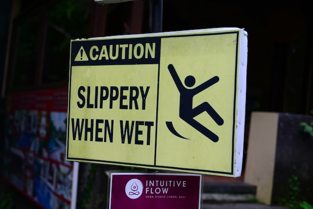
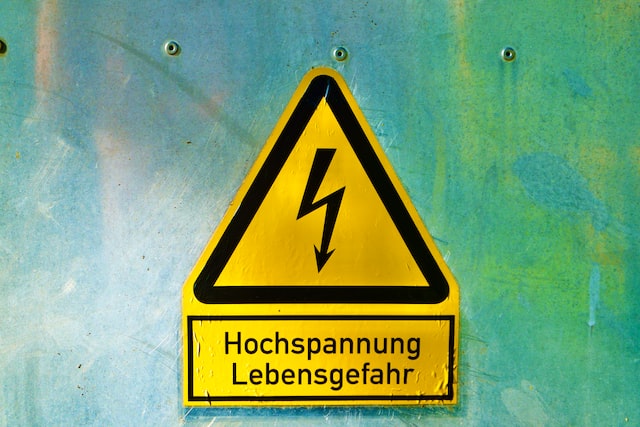
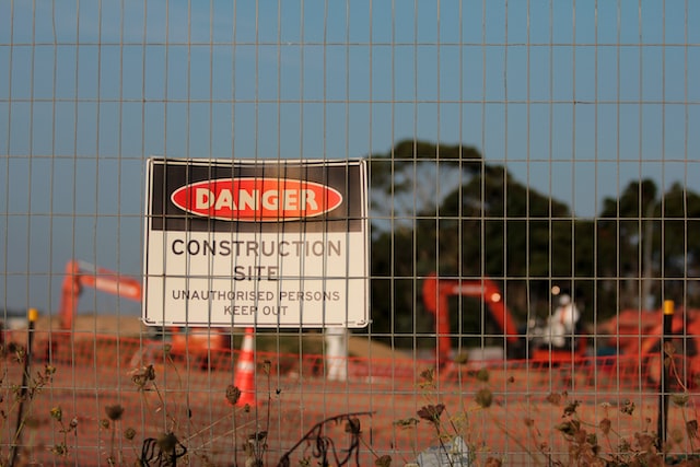
Everybody understands that red is the colour of danger. Therefore, this colour is used to stop a certain action. This is used for fire related signage as well to indicate where the fire hose, extinguishers and emergency telephones are located at. Yellow signifies caution. And you can have this placed on a dull background so that the yellow colour is immediately noticeable. This can be used to warn a visitor or employee against a certain hazard in the premises. There are also colours that can be used for mandatory safe actions. Calm colours such as blue are used for these. These will not grab your attention immediately like red or yellow but having different colours helps to establish a hierarchy. Green is associated with safety and this is usually placed to indicate first aid kits, safety materials, emergency exits etc. The way we perceive red, yellow and green colours are tied to how we view traffic lights. Red is what immediately stops us in our tracks while green is the safe colour for “go”.
The shape of the sign will also impart some information to the person viewing it.
Hazard signs are usually printed on a triangle or diamond shape. This is an unusual shape that will catch your attention. And mandatory actions will be placed on a round signage. To give directional information, rectangles or squares are used. Check the standard used in your country when it comes to designing safety signage so that you can comply with the specific requirements. When you take in new employees, there should be compulsory training given so they understand what the safety signage signifies.